Gerícht: Restaurant Website
Modern UI/UX restaurant landing page with CSS animations, parallax effects, responsive layout, and dark-themed design system.


This was my deep-dive into CSS mastery — before Tailwind, before component libraries, just raw CSS with the BEM methodology and deliberate design decisions. It stands as a showcase of high-fidelity responsive layouts, elegant motion flows, and custom media players.
What I Built
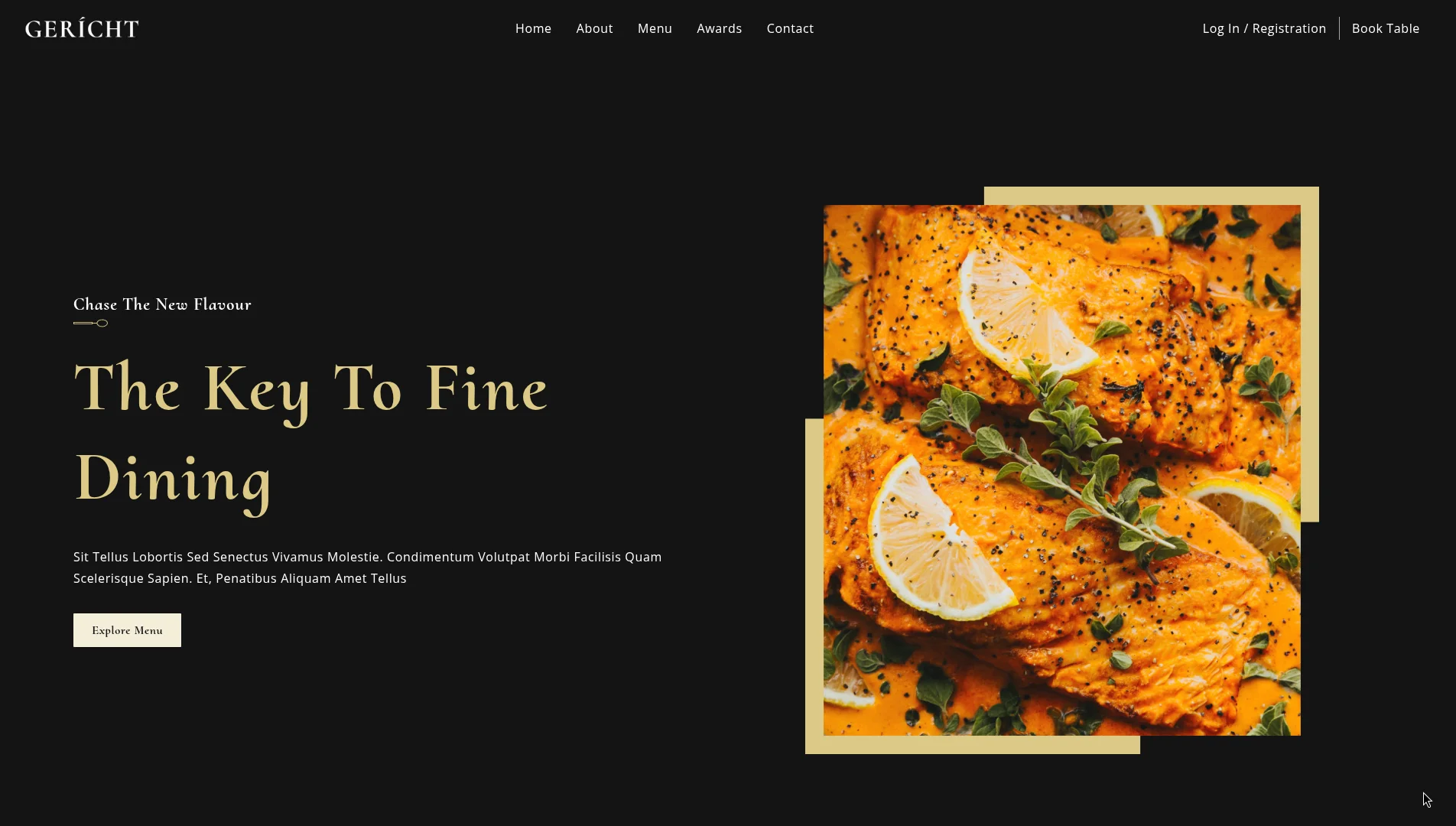
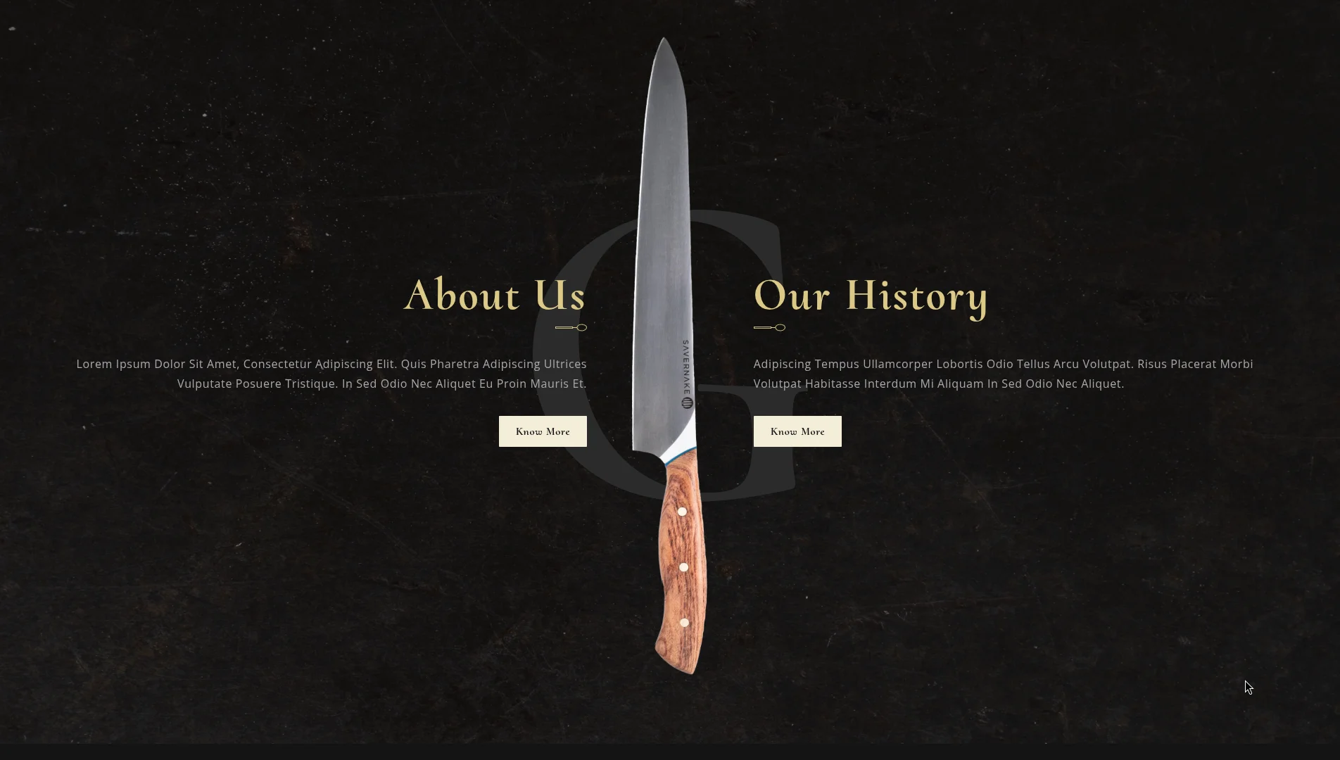
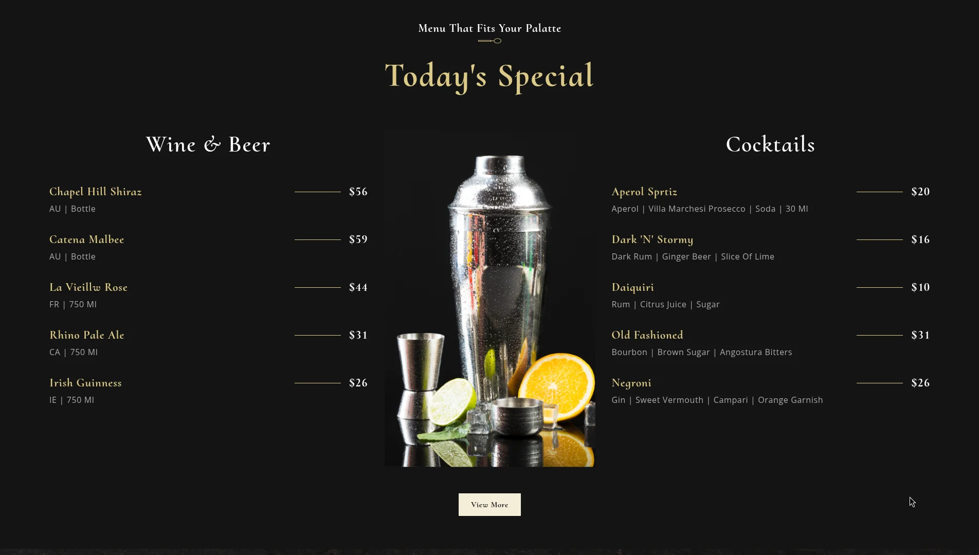
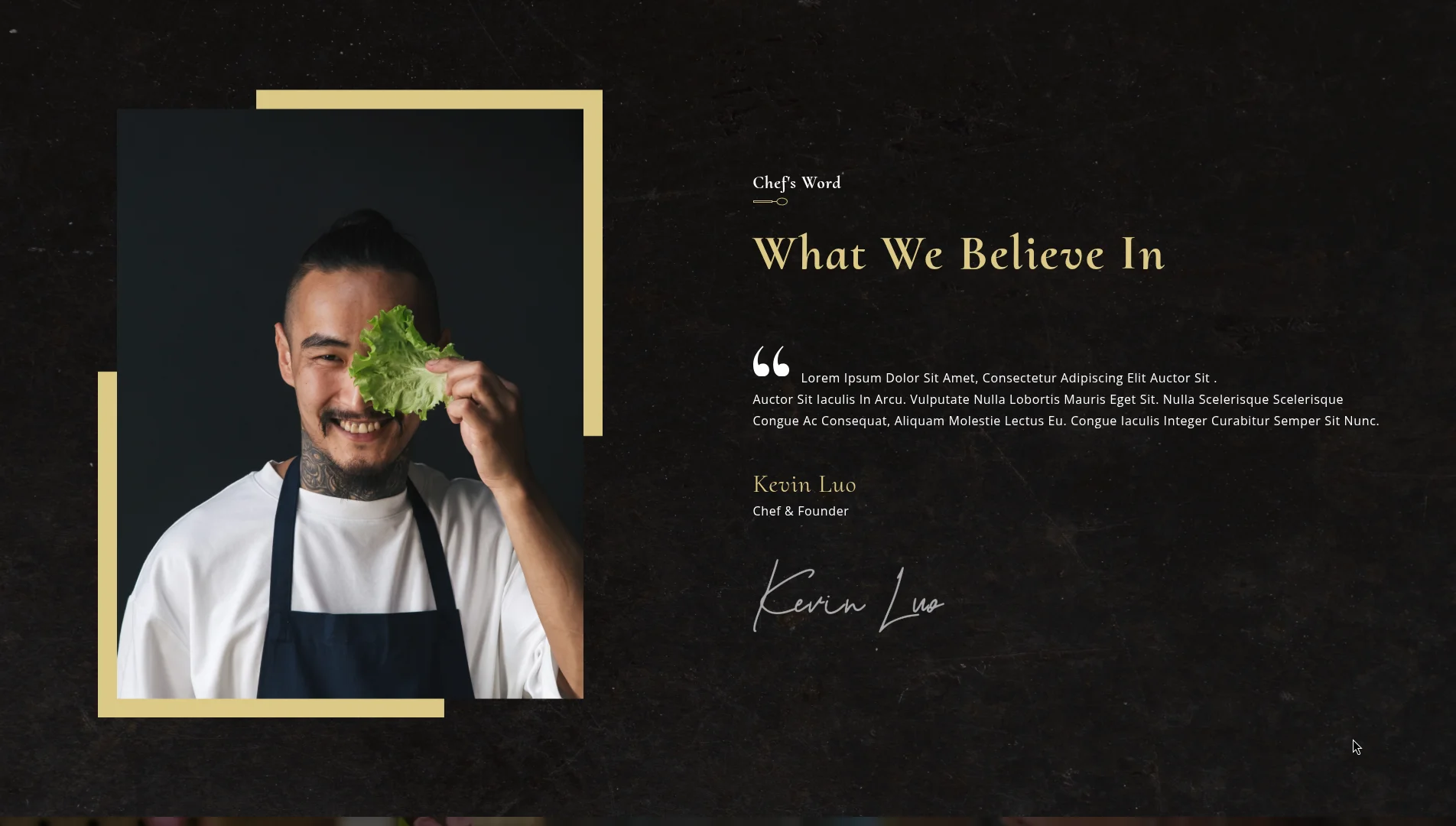
A complete restaurant landing page for a premium fine-dining restaurant called Gericht. The goal was to practice visual design fundamentals and React stateful interaction logic:
- Custom HTML5 Overlay Video Player: Local video playback module with state-driven custom play/pause overlay controls.
- Parallax Hero Section: Header module utilizing background attachment scrolls for fluid visual transitions.
- Scroll-Triggered Transitions: Smooth fade-in and slide animations mapped to BEM styling structures.
- Modular Component Tree: Clean separation of layout sections into discrete, reusable React components (
AboutUs,Chef,Findus,Footer,Gallery,Header,Intro,Laurels,Menu). - Responsive Layout Design: Hand-crafted CSS Grid and Flexbox layouts adjusting across 5 custom media query break-points.
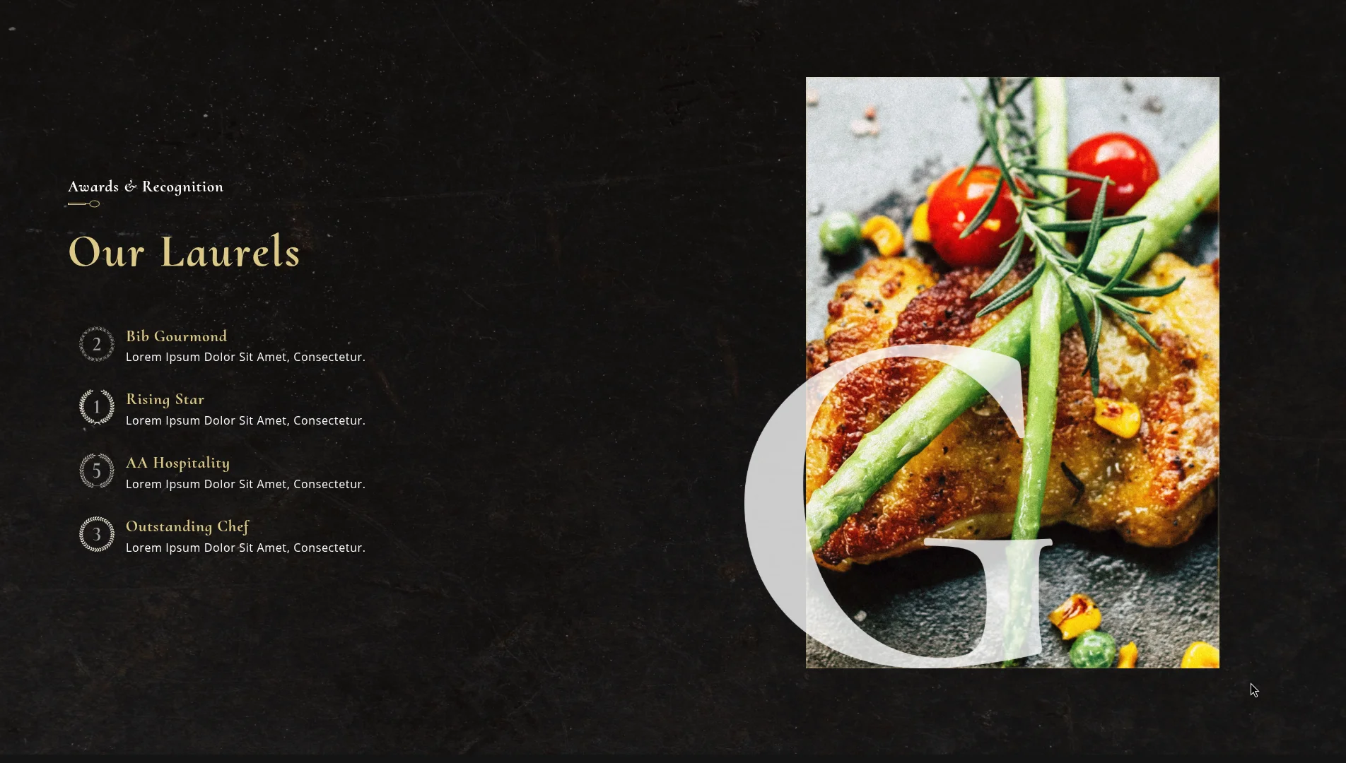
- Sophisticated Typography & Palette: Contrast design using gold highlights (#DCCA87) on black backgrounds (#0C0C0C), featuring Cormorant Upright headers paired with Open Sans body copy.
Custom Video Player Integration
Instead of standard HTML5 browser controls, the video introduction uses a custom play/pause state wrapper mapped to a React reference to toggle media playback dynamically on container clicks:
import React from 'react';
import { BsFillPlayFill, BsPauseFill } from 'react-icons/bs';
import { meal } from '../../constants';
import './Intro.css';

const Intro = () => {
  const [playVideo, setPlayVideo] = React.useState(false);
  const vidRef = React.useRef();

  return (
    <div className="app__video">
      <video
        ref={vidRef}
        src={meal}
        type="video/mp4"
        loop
        controls={false}
        muted
      />
      <div className="app__video-overlay flex__center">
        <div
          className="app__video-overlay_circle flex__center"
          onClick={() => {
            setPlayVideo(!playVideo);
            if (playVideo) {
              vidRef.current.pause();
            } else {
              vidRef.current.play();
            }
          }}
        >
          {playVideo ? (
            <BsPauseFill color="#fff" fontSize={30} />
          ) : (
            <BsFillPlayFill color="#fff" fontSize={30} />
          )}
        </div>
      </div>
    </div>
  );
};

export default Intro;
CSS Architecture (BEM)
All styling rules are organized under the Block Element Modifier (BEM) methodology. This avoids selector nesting bugs and enforces high class scoping:
/* Block */
.app__specialMenu {
  display: flex;
  flex-direction: column;
  width: 100%;
}

/* Element */
.app__specialMenu-title {
  margin-bottom: 2rem;
  text-align: center;
}

/* Modifier */
.app__specialMenu-title--large {
  font-size: 4rem;
  font-weight: 700;
}
Responsive Design System
Media queries are segmented into 5 distinct thresholds to ensure graceful layout degradation from large 4K screens down to small mobile viewports:
@media screen and (min-width: 2000px) { /* Ultra-wide displays */ }
@media screen and (max-width: 1150px) { /* Tablet landscape */ }
@media screen and (max-width: 900px)  { /* Tablet portrait */ }
@media screen and (max-width: 650px)  { /* Large mobile */ }
@media screen and (max-width: 450px)  { /* Small mobile */ }
Key Learnings
This project taught me to think in layouts before thinking in code. Before writing a single CSS rule, I sketched the component grid on paper. That habit of visual planning before implementation has stayed with me through every project since.
It also drove home that great typography is the backbone of great UI. The font pairing (Cormorant Upright for headings, Open Sans for body) carries the entire visual identity.